
Bike Tours Portugal: Rebranding, Website and Brand Activation
Branding
To develop the rebranding of Bike Tours Portugal we aligned a new strategic positioning with the offer of BTP Tours, which provides a more sustainable, light, ecological and authentic tourist experience.
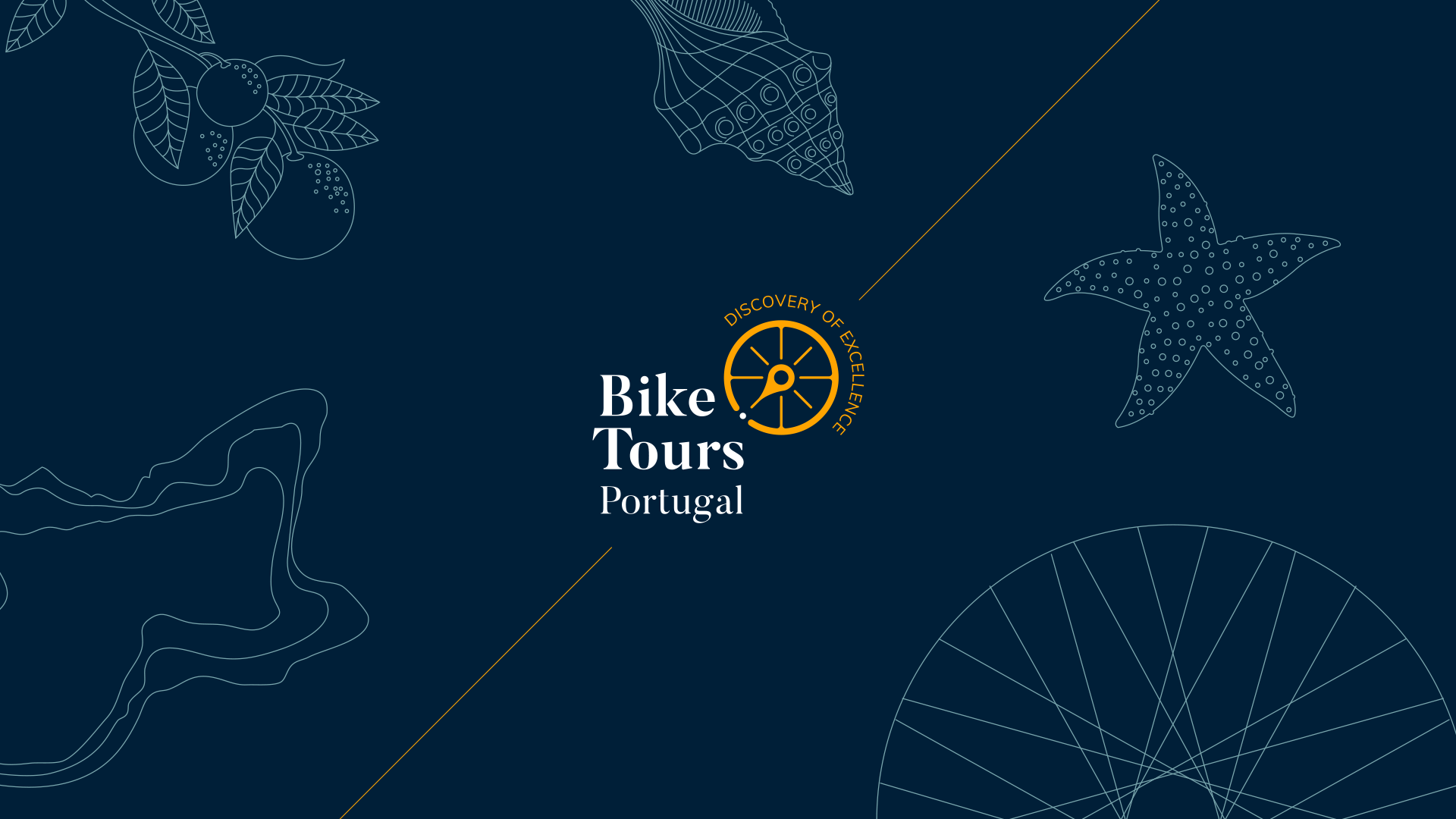
The logo combines three elements in a simple way: the bicycle (movement), the sun (an endless source of energy) and the wind rose (focusing on the region where BTP develops its activity - the Southwest of Portugal). The symbol is, thus, an invitation to discover the region, and the signature accompanies it in a semicircle to reinforce the idea of movement - the journey and the geographical orientation of the destination, marked by the cardinal point.
In addition to the Bike Tours rebranding, we worked on a graphic update of the website, the presentation video of the brand and the activation of the new identity on social networks.
