scroll
EZATA: Naming and Identity Development
Branding
The result was the creation of the naming, EZATA, which is inspired by something that is correct, that has no mistake, timely and accurate, just like the values of quality, security and tranquillity of the sector.
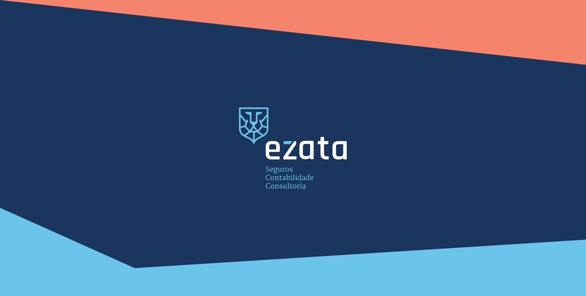
The identity that was developed reflects the brand's standards of protection, security and excellence, together with an up-to-date lettering, able to give strength, presence and distinction to the series of EZATA integrated services.
The colours that were chosen are a perfect reflection of the values of proximity, tranquillity, calm and seriousness, indispensable to EZATA clients.


