BLIVO: Branding and Visual Identity for Authentik Brands
Branding . Design
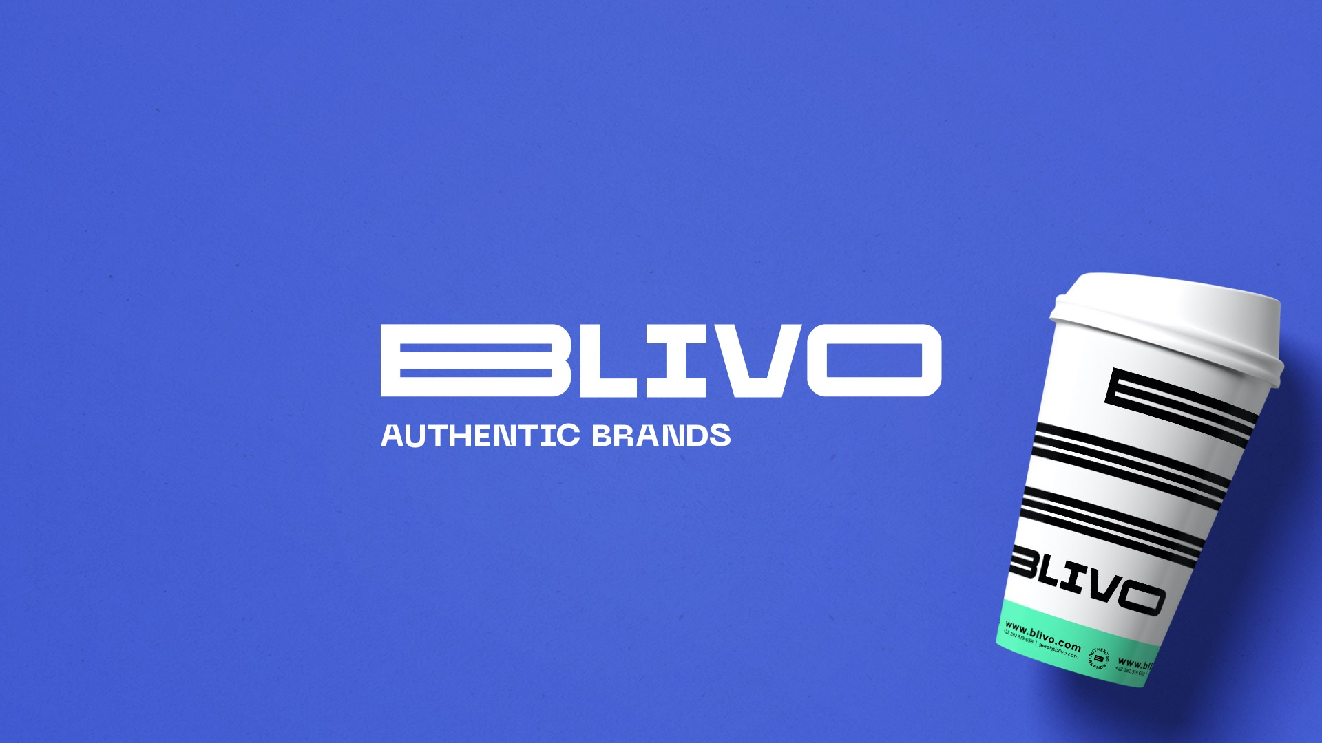
LOBA was challenged to create a new, simple and effective brand, a brand that represents movement, agility, dynamism and irreverence. This is how BLIVO - Authentik Brands was created.
The brand identity fell on a strong element, the letter B for believe, in order to provide flexibility and adaptation to the brand's look and feel.
The typography used in the identity conveys the organization, responsibility and the ideas of automation and robotics present in the brand's core and know-how, but also a cool and futuristic environment, through bold elements.
The color palette used is sober and corporate enough, through the use of black in the logo. The remaining visual elements follow digital trends and the malleability of a brand with grit and future.