
Resiliage: Visual identity
Branding
RESILIAGE aims to improve disaster risk management by understanding people's reactions and developing support tools for stakeholders - before, during, and after natural or human-induced disasters.
We carefully analyzed the project to create the visual identity, identifying the target audience, brand values, attributes, positioning, and language.
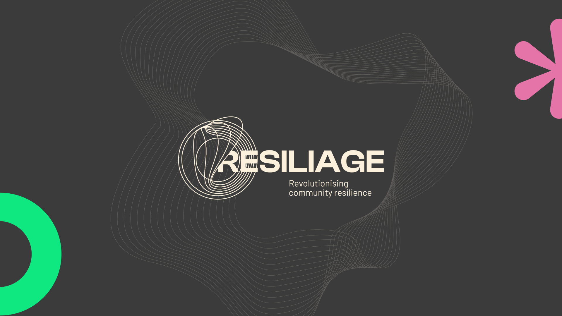
We drew inspiration from the circle, symbolizing community and heritage, and the flexibility of lines, reflecting the adaptability to change necessary in disaster situations. The lines also convey the idea of movement, representing the volatility of nature and its ability to disrupt society's well-being. Each element was chosen with a specific purpose, adding depth and relevance to the visual identity.
The predominant colours are grey and beige, reflecting the contrast between natural disasters and stakeholders' resilience. To create contrast, we used green, orange, and pink, representing the technological innovation of the project's tools, the heritage that must be preserved in affected areas, and the community, respectively.
Additionally, 5 identities were created for the pilot locations (CORE Labs) where the project will operate: Belgium, Greece, Portugal, Norway, and Turkey. These CORE Labs' visual identities were designed to convey unity amidst diversity. While each CORE Lab shares a consistent design structure, subtle variations in colours, shapes, and icons represent the different challenges and characteristics. This approach ensures cohesion in the project while celebrating the individuality of each location.
