scroll
Garsteel: Rebranding
Branding . Design
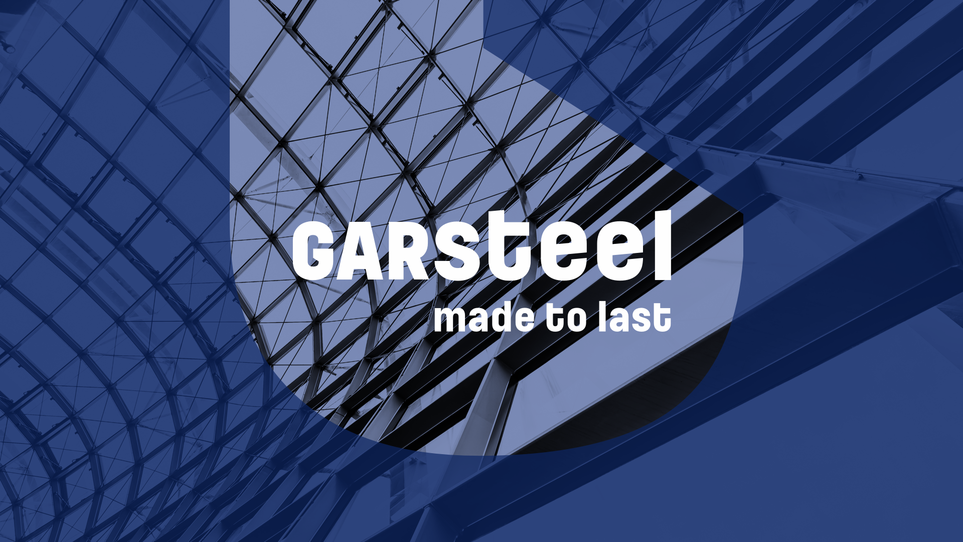
The claim 'Made to Last' serves to reinforce the quality of construction that GARSTEEL places in every structure built, and in every project developed.
The chosen identity colors revolved around the blue and gray tones, with added weight and strength associated with GARSTEEL's raw material - steel.
The letter “G” assumes this weight, imposing a solid presence, like an industrial tool or machine.