
PATTERN: Visual identity
Branding . European Projects
After an extensive analysis of the project, which included pre-identifying the target audience as well as the brand values, attributes, positioning and language, the team developed the new identity for the PATTERN project.
This project promotes training that will enable Higher Education Institutions (HEIs) and research organizations to improve the excellence of the science conducted, the capacity in the European Research Area (ERA) to face societal challenges and the interaction between science and society.
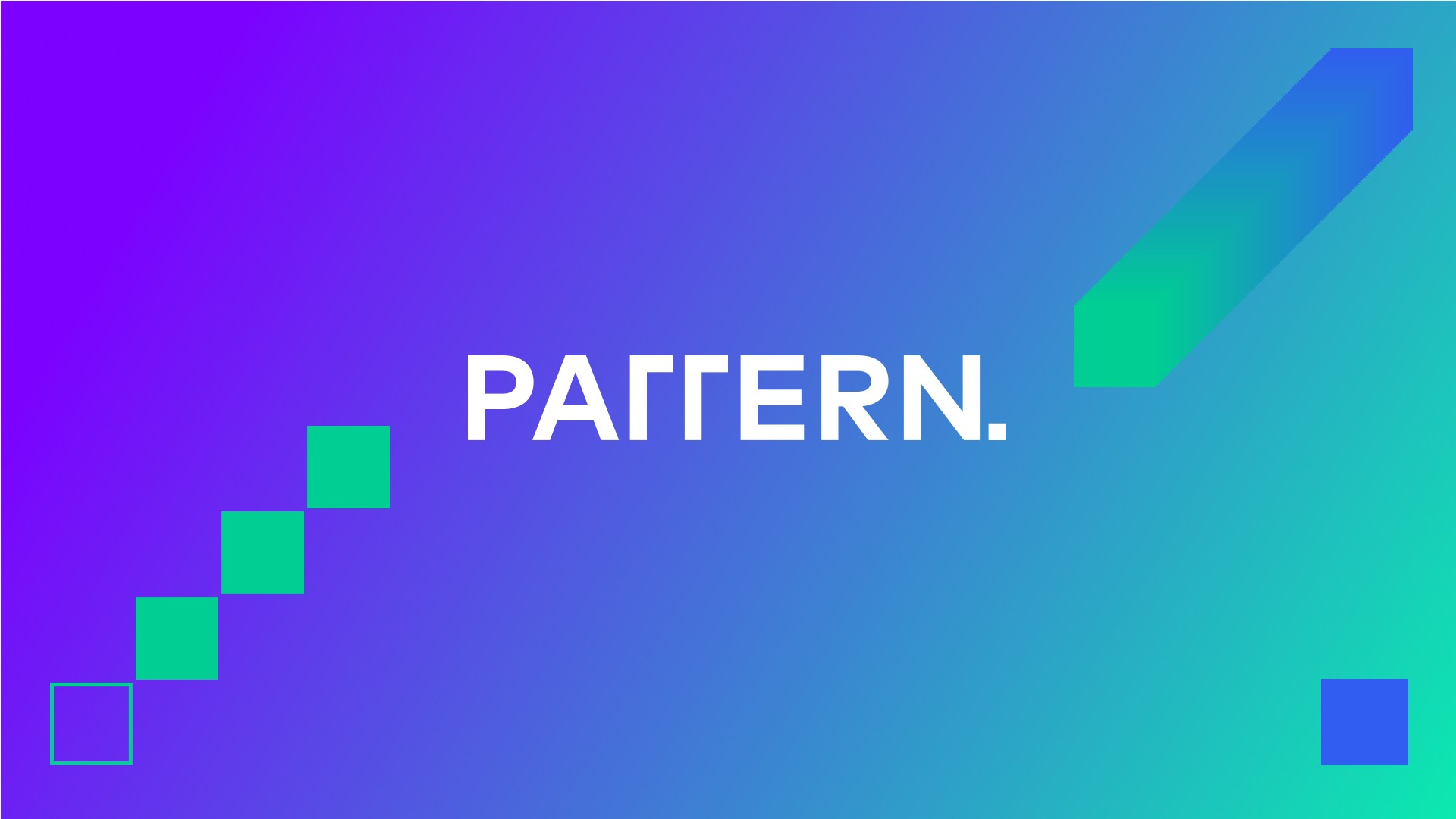
For the visual identity a kind of pattern was created with lines and dots. The lines represent the route that allows receiving knowledge or sending new discoveries. The pattern represents the transfer / movement of knowledge from point A to B and the new ideas that are formed with these first two elements are represented by a dot.
Regarding the font chosen for the logo, it aimed to convey the feeling of reliability and, at the same time, sobriety, using a font with more square lines.
In terms of colours, purple takes us to Technology (Discreet, sober, research), while green reflects the idea of Research/New ideas.
Finally, a brand manual was developed dictating the rules and guidelines about the elements of PATTERN's identity and how it should be used.
The identity created for the project aimed to provide a cohesive visual identity for the project. The identity will be used in the various materials produced as part of the project including templates, brochures, website, posters, roll-up banners and videos etc.
