
Foodstories: Identity
Branding . European Projects
The overall concept of the FOODSTORIES project aims to improve the skills of students (graduates and PhDs), researchers, teachers and other academic staff by producing innovative materials and methodologies so that they are able to communicate their research activities and improve universities' ability to teach food science communication.
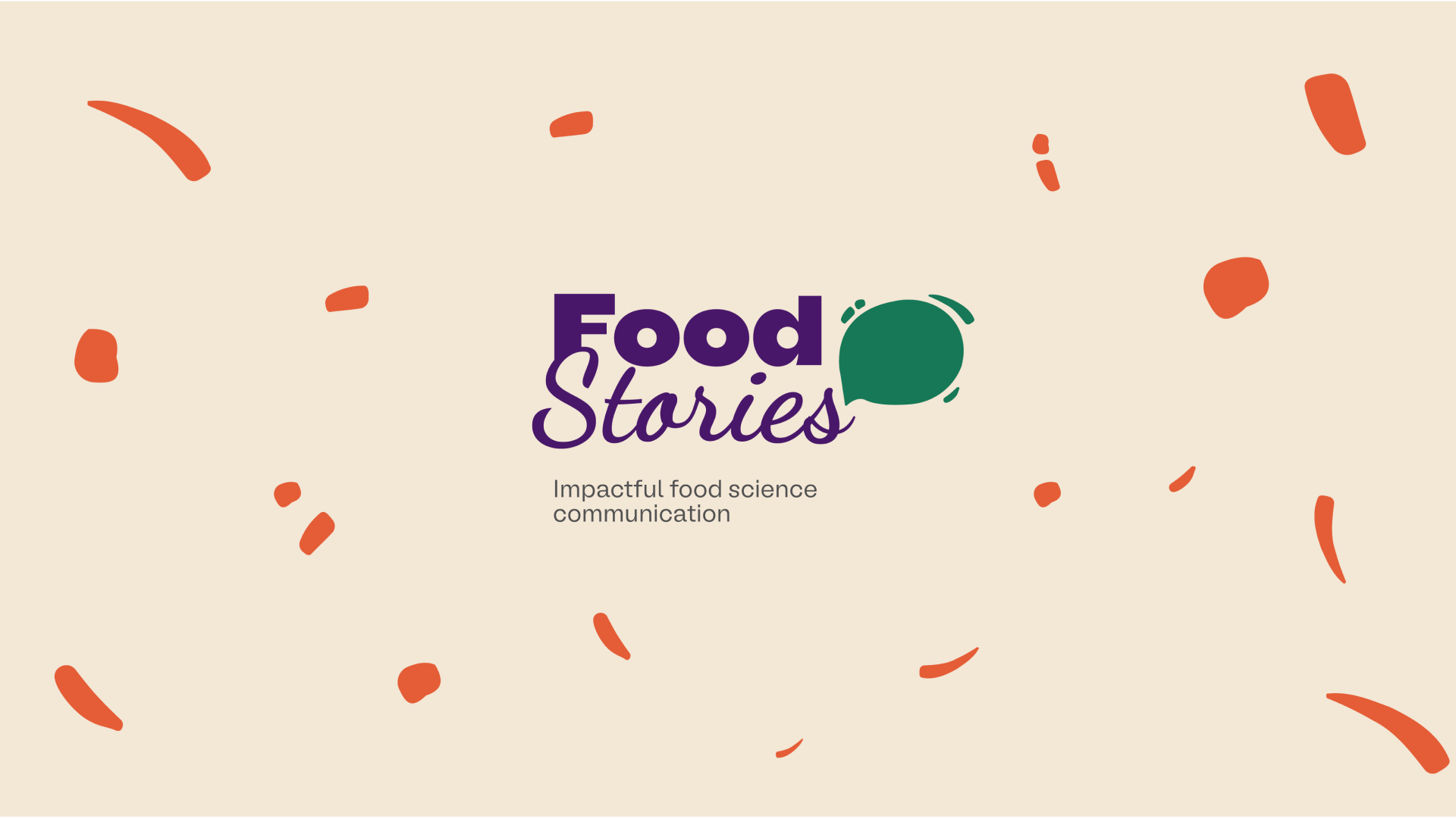
The visual identity was inspired by the speech balloon that represents storytelling or the transfer of information. We chose the fonts for the logo considering that the project focuses on telling "stories" about food science communication to the public. In this way, the fonts are rounded to make the logo more user-friendly and to be in balance with the communication.
As for the colors chosen, purple and green, which represent science and nature respectively, are the main colors. However, orange, yellow and beige were also chosen as complementary and vibrant colors to give the project a more powerful presence among the target audience.
The visual identity created will be used in the various materials produced as part of the project, including templates, brochures, website, posters, roll-up banners and videos, etc.
