FOODCoST: Identity
Branding . European Projects
FOODCoST will redefine the value of food and provide a set of improved and harmonised analytical instruments for valuation and internalisation of externalities to assess the direct and indirect impact, co-create options for solutions, and provide guidance to policy makers, businesses and other actors.
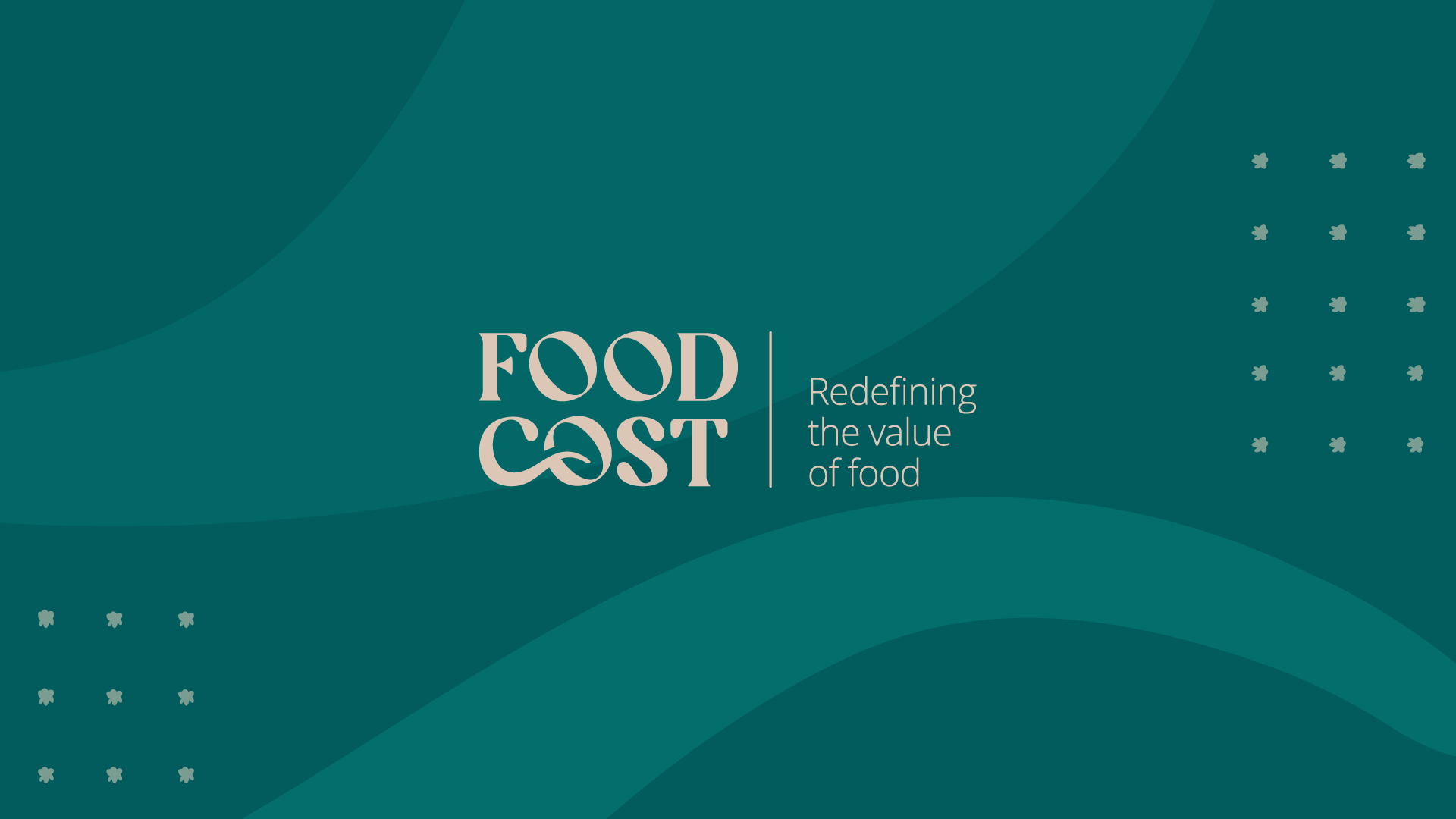
The font chosen for the logo was chosen with the goal of being a simplistic logo to work with the rest of the brand communication, to work in more sober environments. The wave that unites the letters C and O in the logo, meets the areas of the project, not only with the ocean waves (which portray aquaculture and fishing) but also with agricultural fields.
As for the colours, purple refers to wellness, orange to food system, beige to earth cereals, blue to fishing, aquaculture and oceans, and green to sustainability, nature and health.
A brand manual was also developed dictating the rules and guidelines on the elements of FOODCoST’s identity and how it should be used. The brand created for the project aimed to provide a cohesive visual identity of the project. The brand will be used in the different materials produced under the frame of the project namely templates, brochures, website, posters, roll-up banners and videos, etc.


