CONNECT: Branding
Branding . European Projects
It started in September 2020 and aims to offer an inclusive and sustainable model for secondary schools and teachers to increase students' confidence in using science, bringing them together with science professionals and involving family members to improve their attitudes towards science careers. In other words, CONNECT aims to implant in young people the conviction that "science is for me".
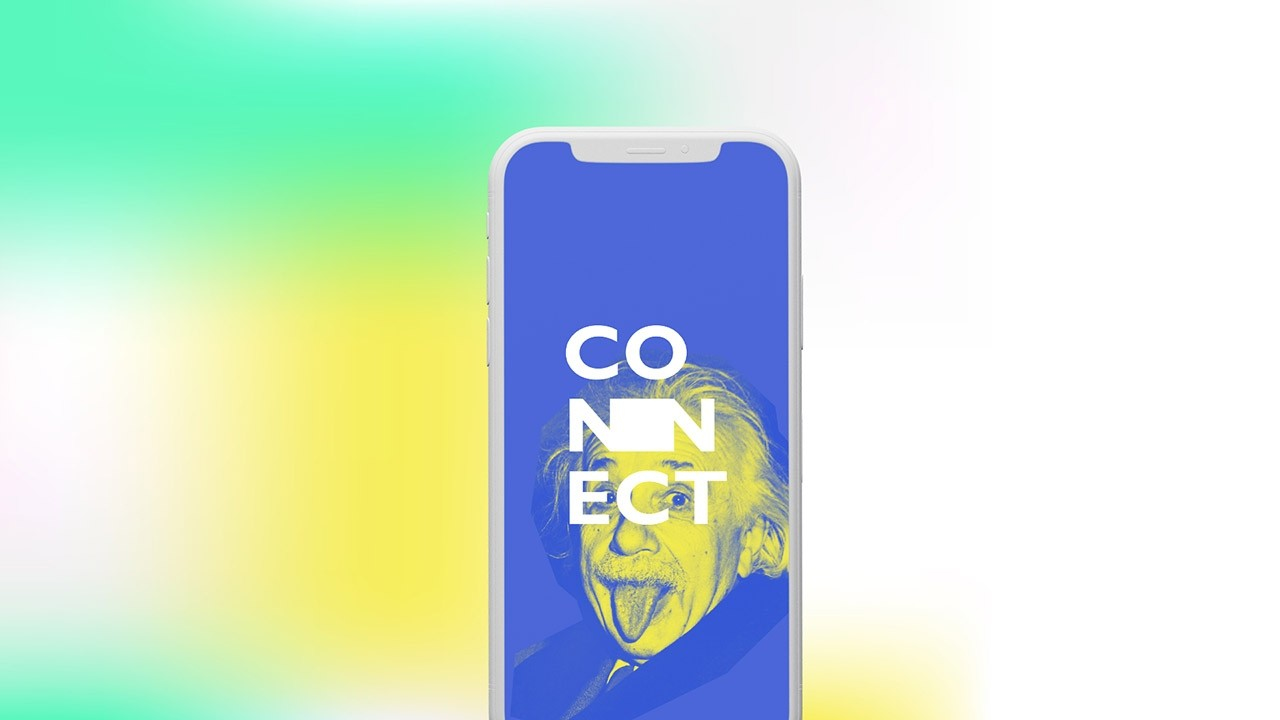
The concept behind this identity was intended to create an attractive and vibrant visual that would catch the attention of both students and secondary school teachers, with a young, modern and appealing design. It was inspired by the creation of a "window to science" with the integration of a space between the "N's" of the word CONNECT that will allow the integration of additional elements for different contexts.
In this way, CONNECT's identity will not be static, but flexible and adaptable to the different needs that the project activities may require. The predominant chromatic use of blue allows for its effective application in communication channels or supports that have both vibrant and sober colours, depending on the target group they are aimed at.
The typography used in the identity, namely Gill Sans in the word CONNECT and Neue Machina for the slogan description, have a modern and young style, but at the same time elegant and professional, which together with the other graphic elements results in a strong, dynamic and creative identity.