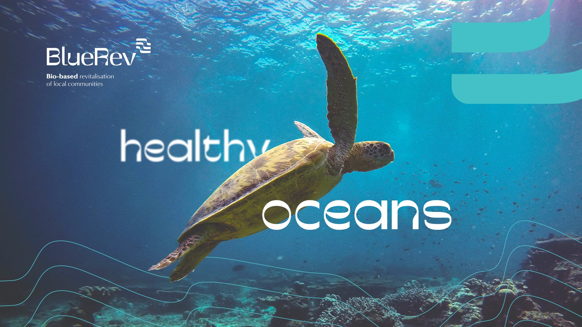
BlueRev: Visual Identity
Branding . European Projects
The overall concept of the BlueRev project is based on the revitalization of European local communities with innovative bio-based business, governance models and social innovations focused on the blue bio-based sector, demonstrating the benefits the wide deployment of the bio-based economy can offer.
The brand created for the project aimed to provide a cohesive visual identity of the project.
The brand symbol brings together various emerging concepts, the main one being the water as an association to the oceans, to the waves of the sea, which is the element that is the basis of the project. The three lines can be associated with the knowledge layers of the project and, simultaneously, the various actors involved in it: each of them will be a strong contribution to the project.
The general shape of the symbol looks like a square with rounded corners, which reinforces the idea of core and solution. The position of the symbol in the upper right corner resembles the location of a flag, referring to navigation and exploration of the ocean.
The typography of the logo was worked with some wavy details as an association to the concept of water. We achieved a lettering with personality, robust, but, at the same time, sober.
For a correct usage of the logo, LOBA has developed a brand manual.


