LIFT
Branding . European Projects
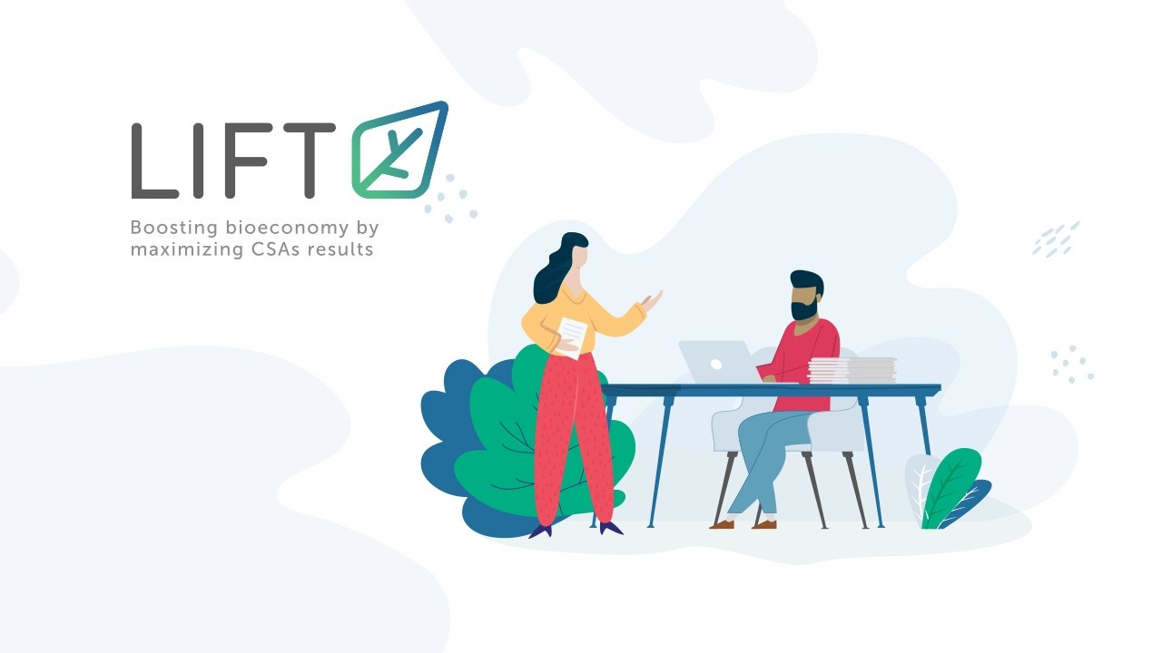
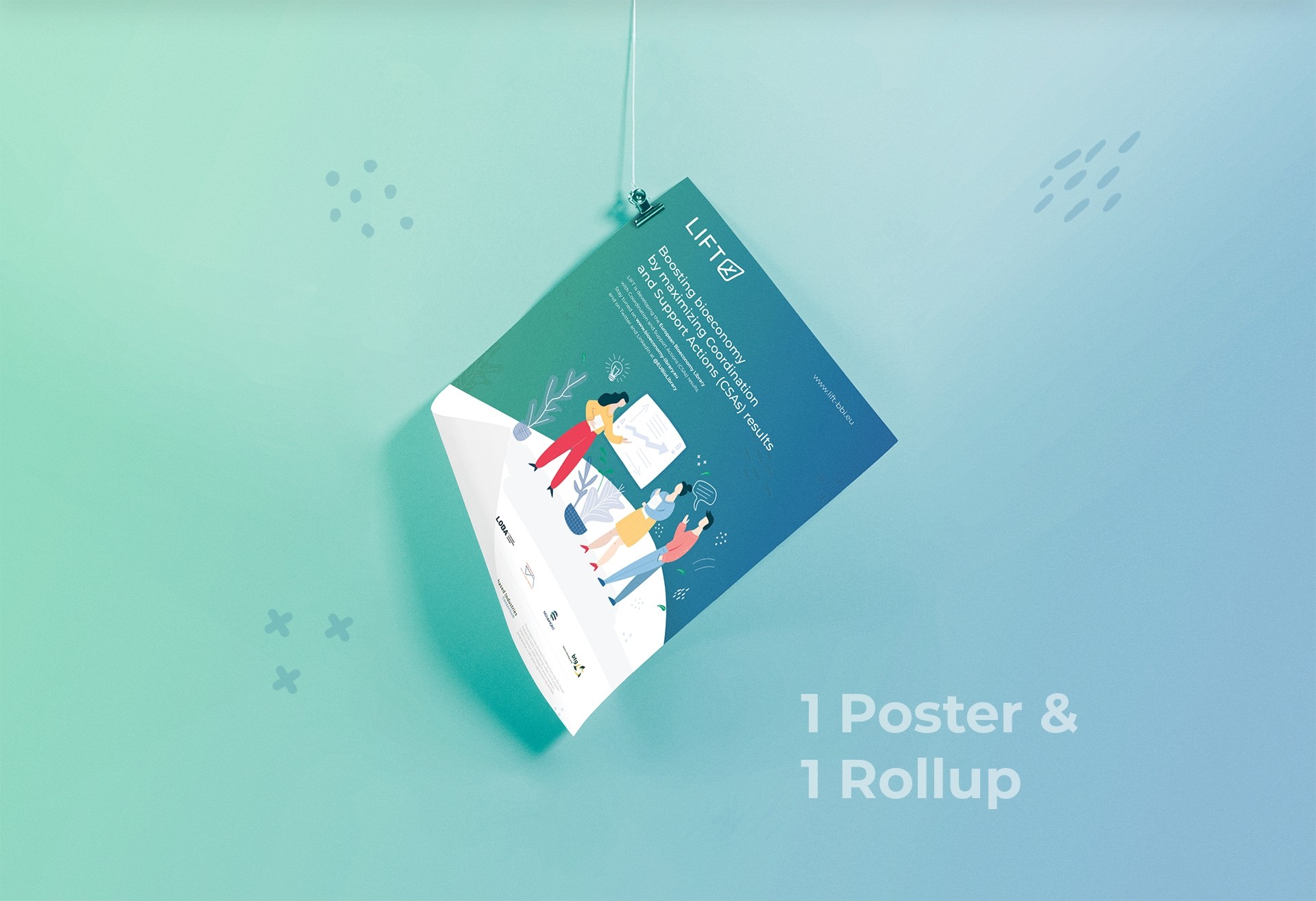
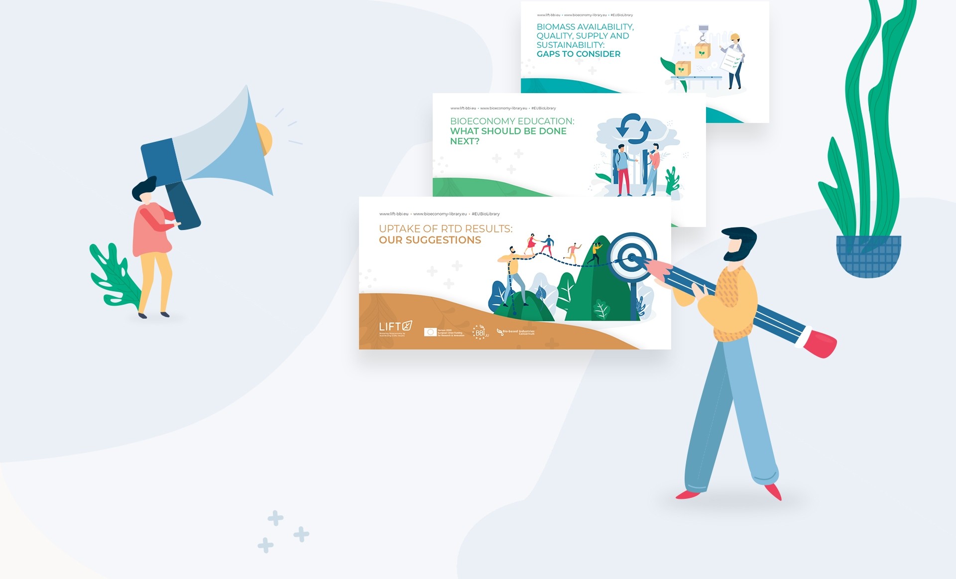
The creation of the corporate identity of the European project LIFT - "Boosting Bioeconomy by maximising CSAs results", had as a requirement the allusion to the concept "lift" and the concept of bioeconomy, through the use of a leaf rising, which creates the desired effect, and thus does justice to the name of the project and its goal. The green and light blue colours refer to the bioeconomy.
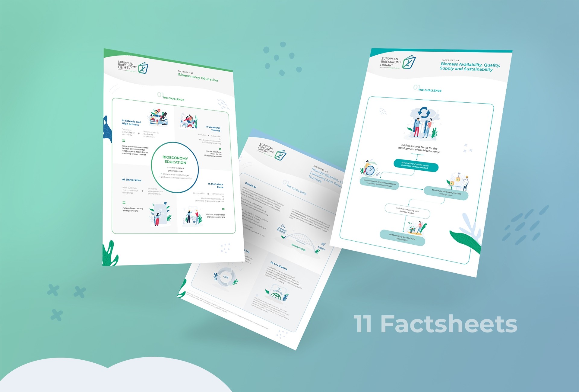
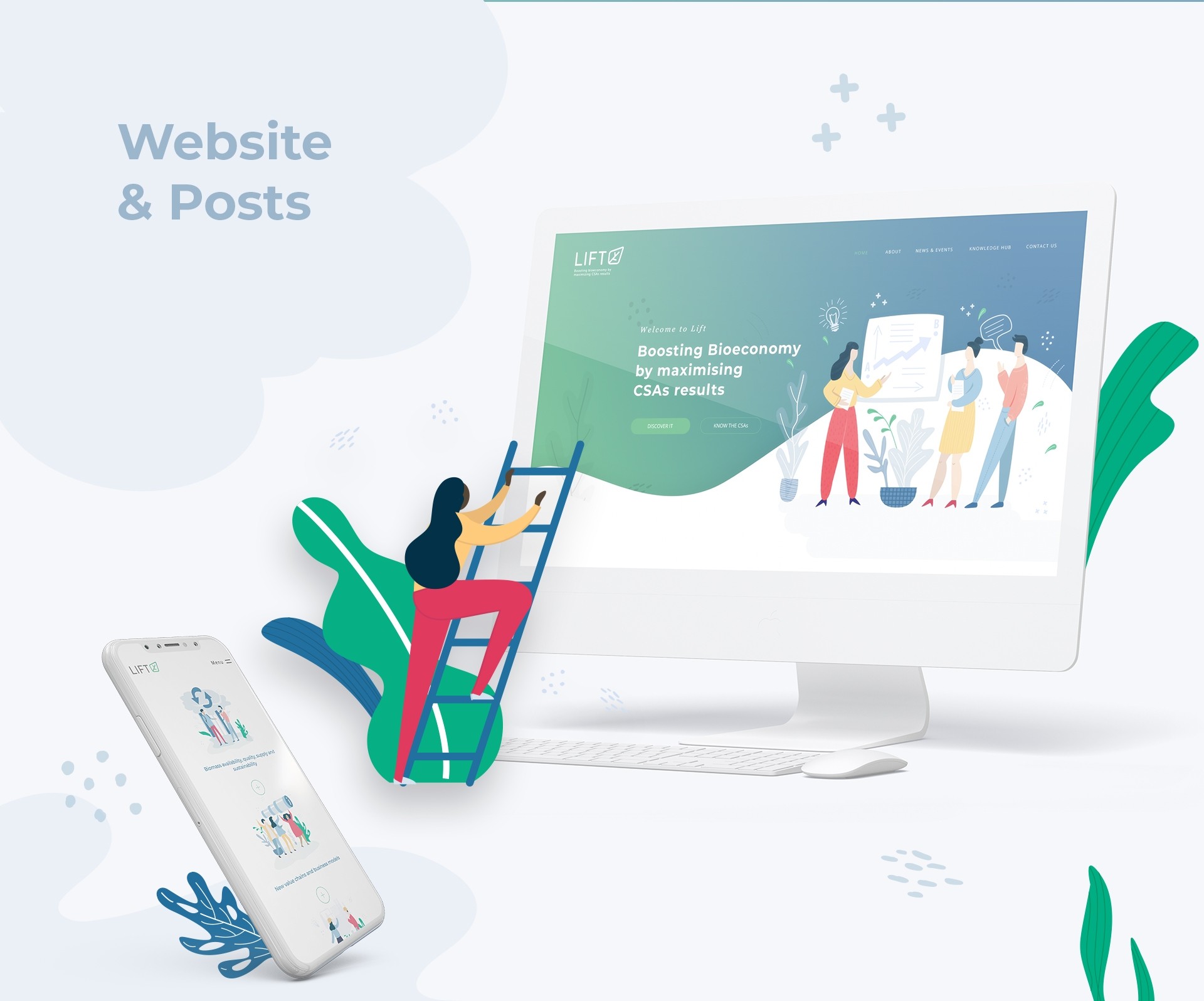
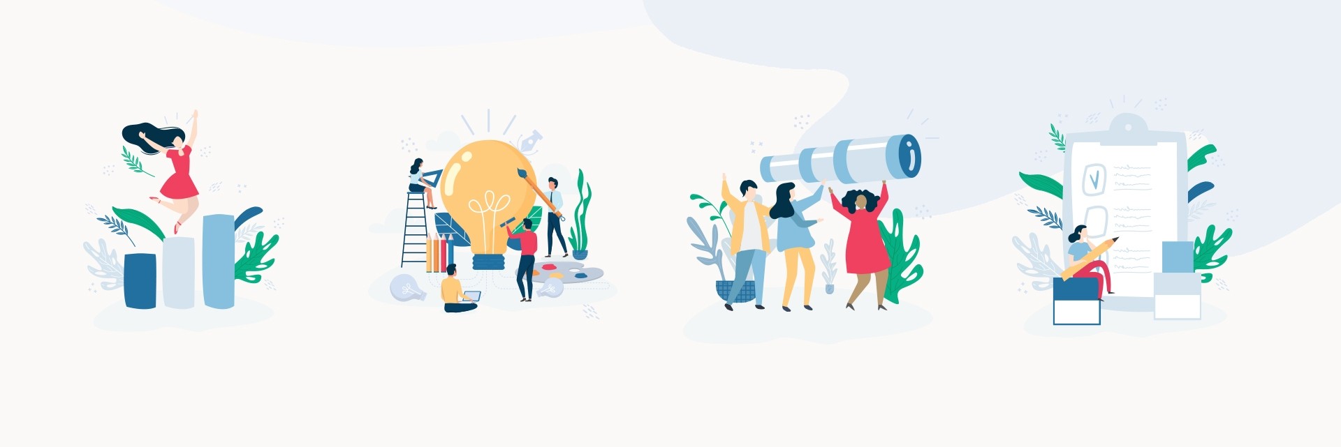
LOBA also developed the project's website, as well as other materials. For its development, the concept of Bioeconomy was taken into account, once again, being associated in this way to the predominant green and also to the leaves that are present in almost all the illustrations of all materials.
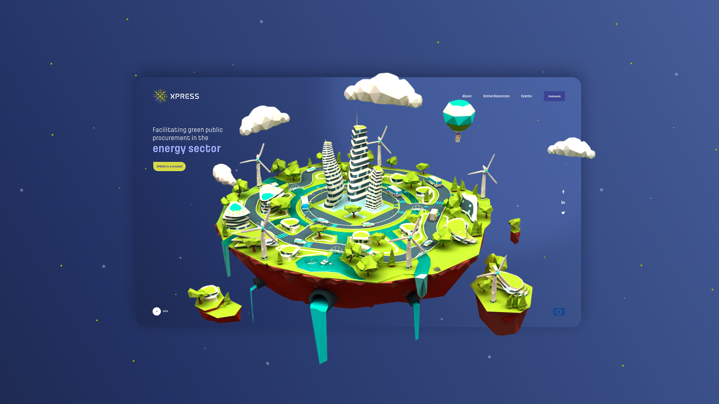
The challenge set for this project generated a clear, concise and informative website, where one can easily understand what is the main goal and its scope.