ICARUS
Branding . European Projects
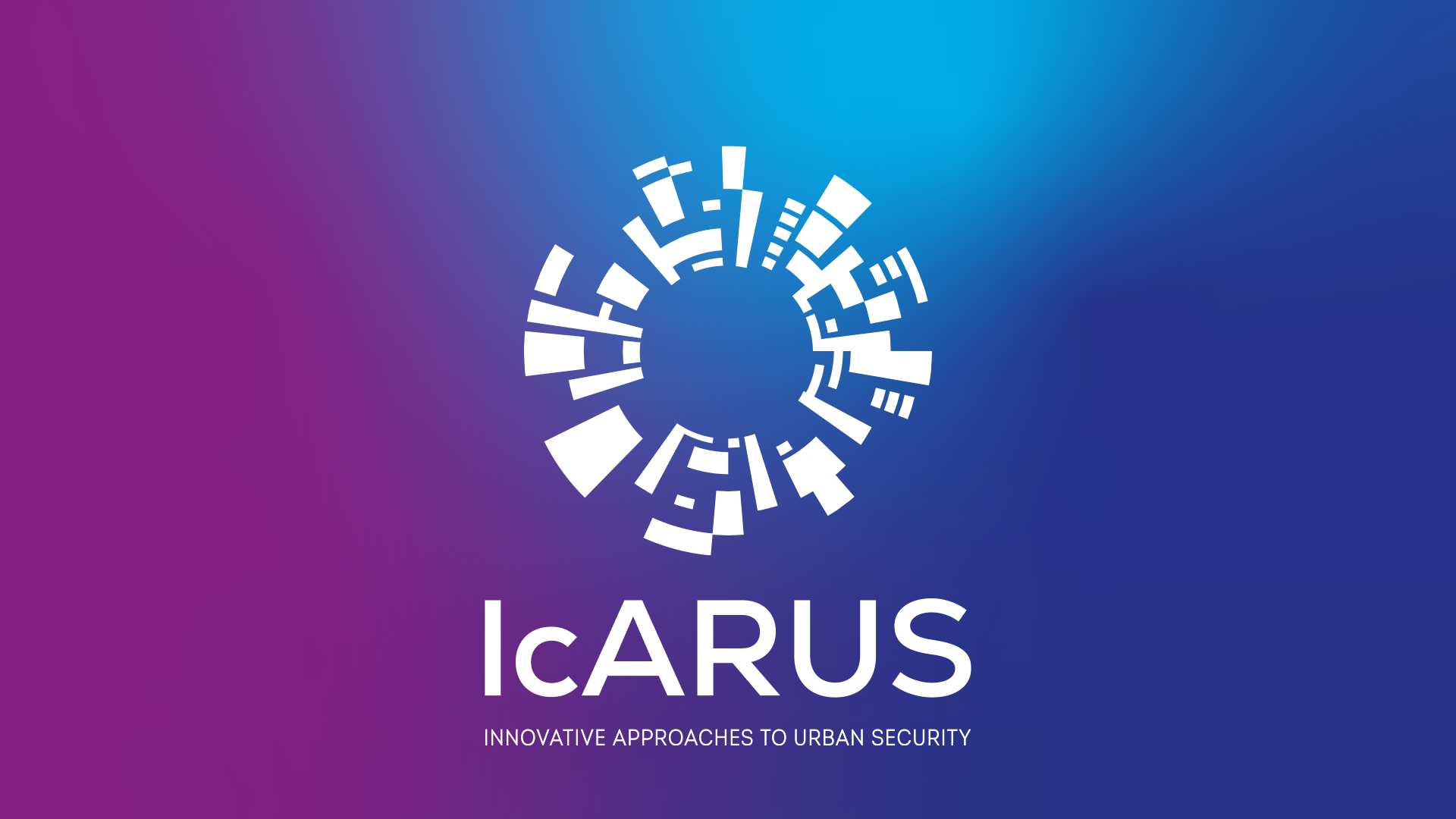
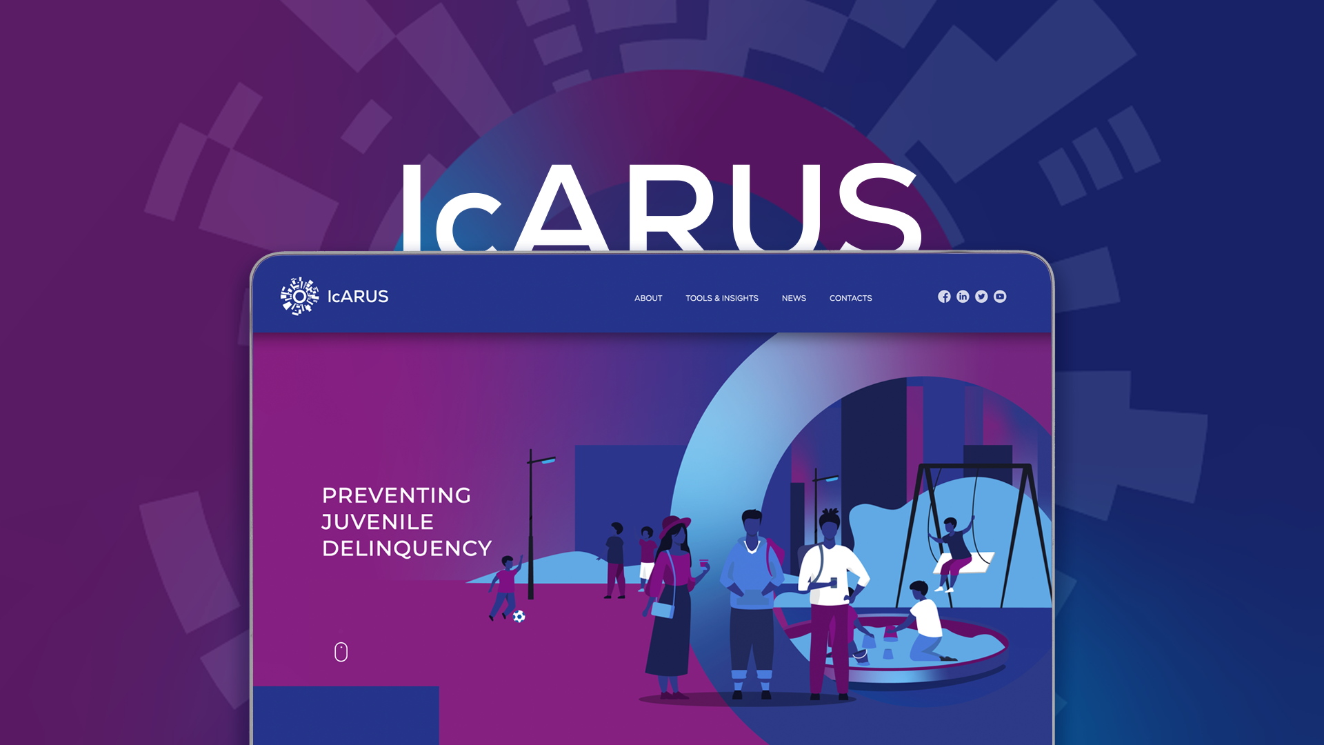
The inspiration behind the logo was the connection between the city (represented by the geometric contours of a city seen from above that surround the shield) and shared information (represented by the round shape of the logo – in the sense that everything is connected) the circle also symbolizes interconnectivity and team work, which is also reminiscent of the myth of IcARUS. We have chosen the colours of the logo for the following reasons: blue for security, and purple for the logo’s connection to technology.
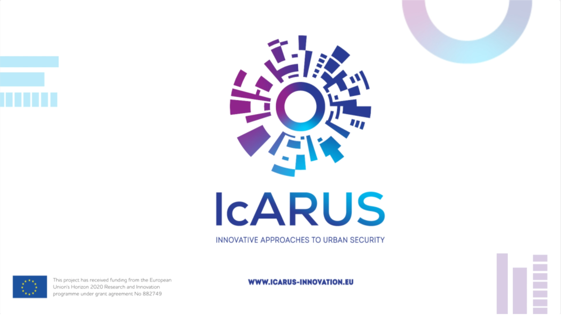
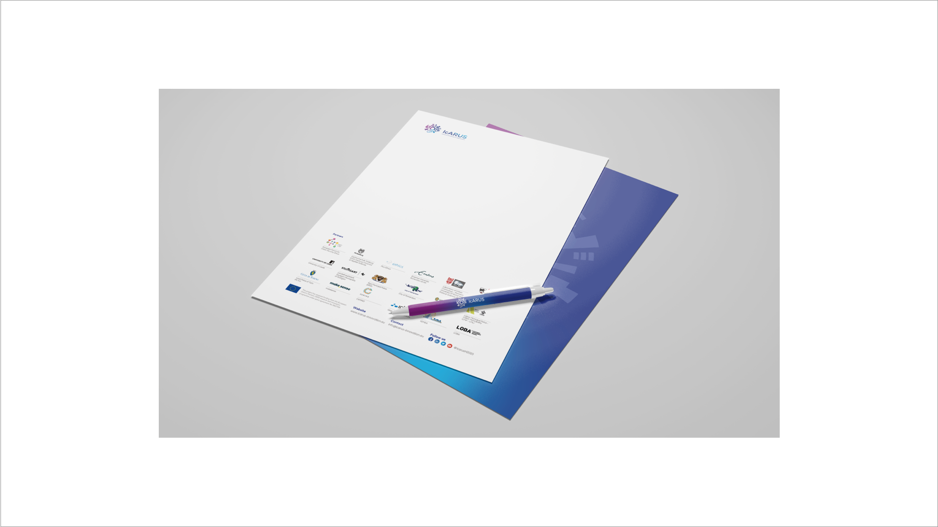
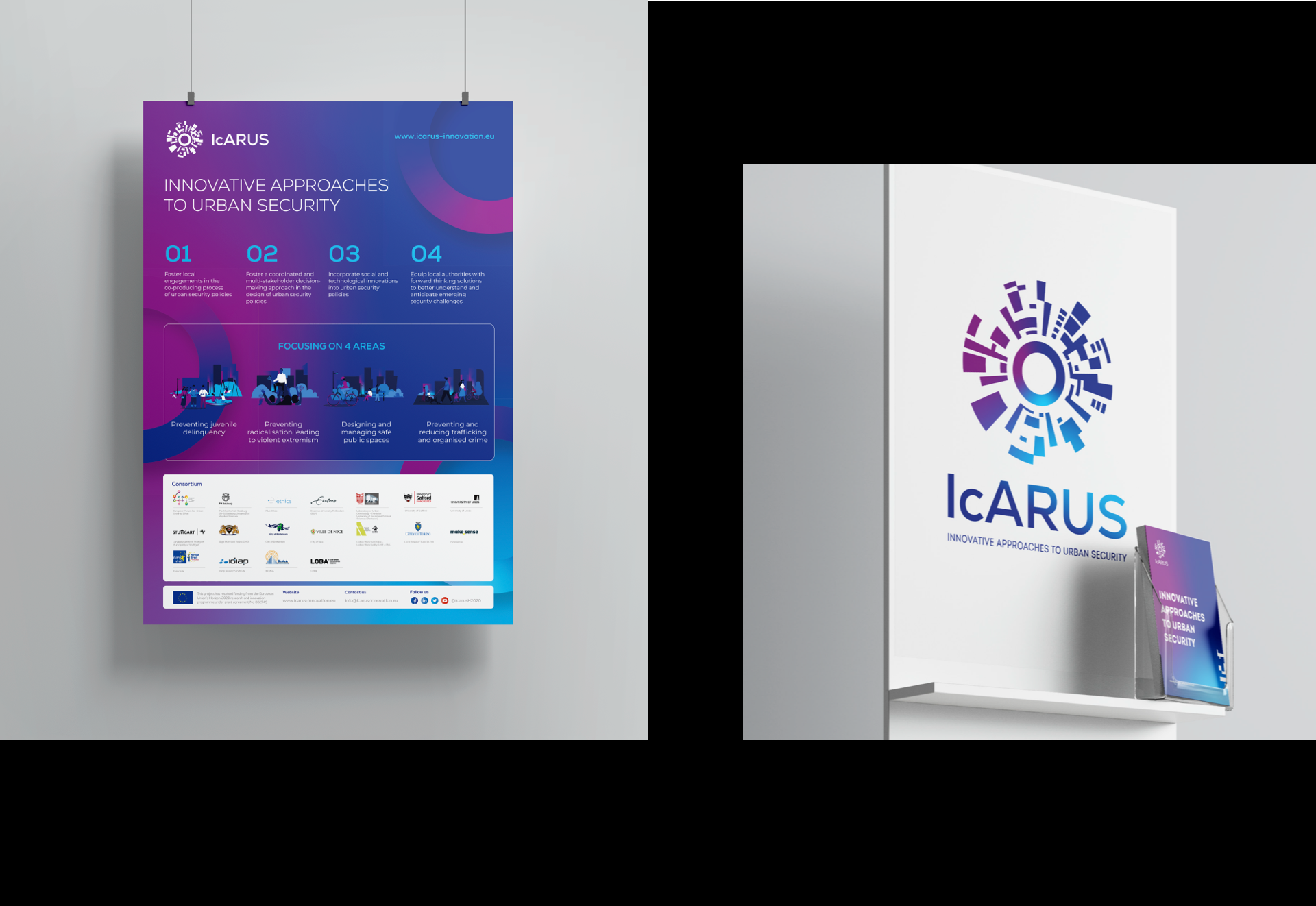
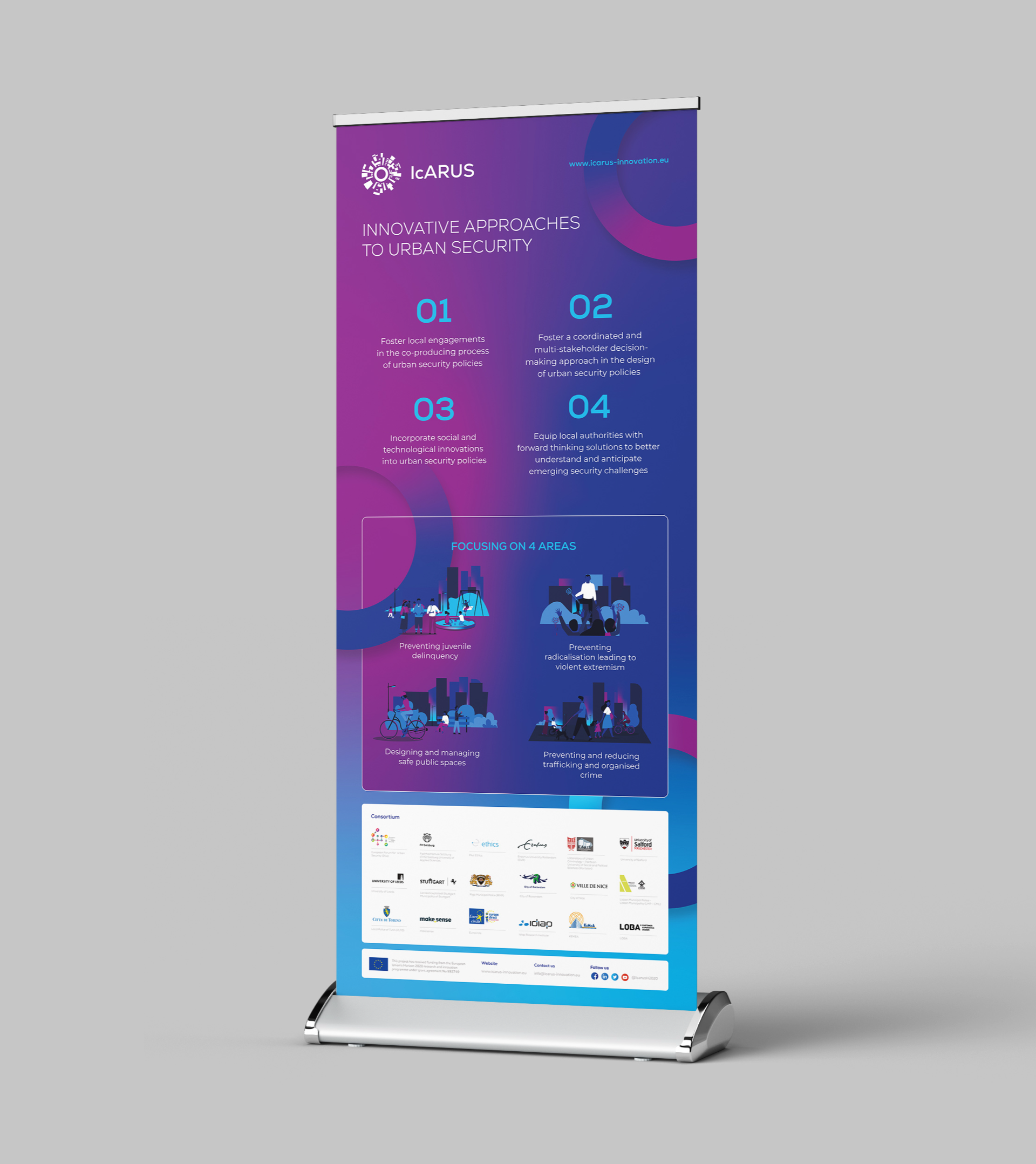
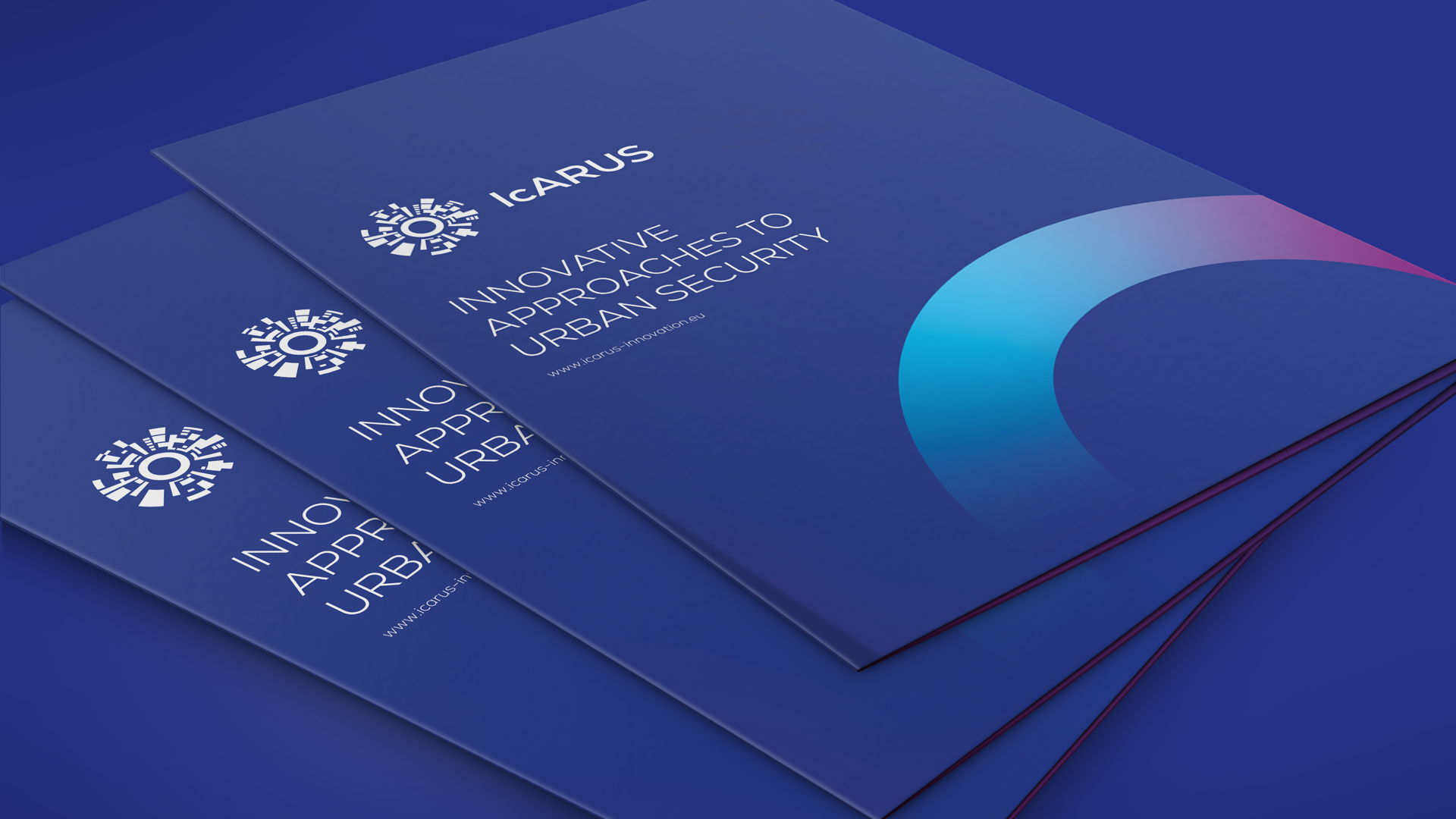
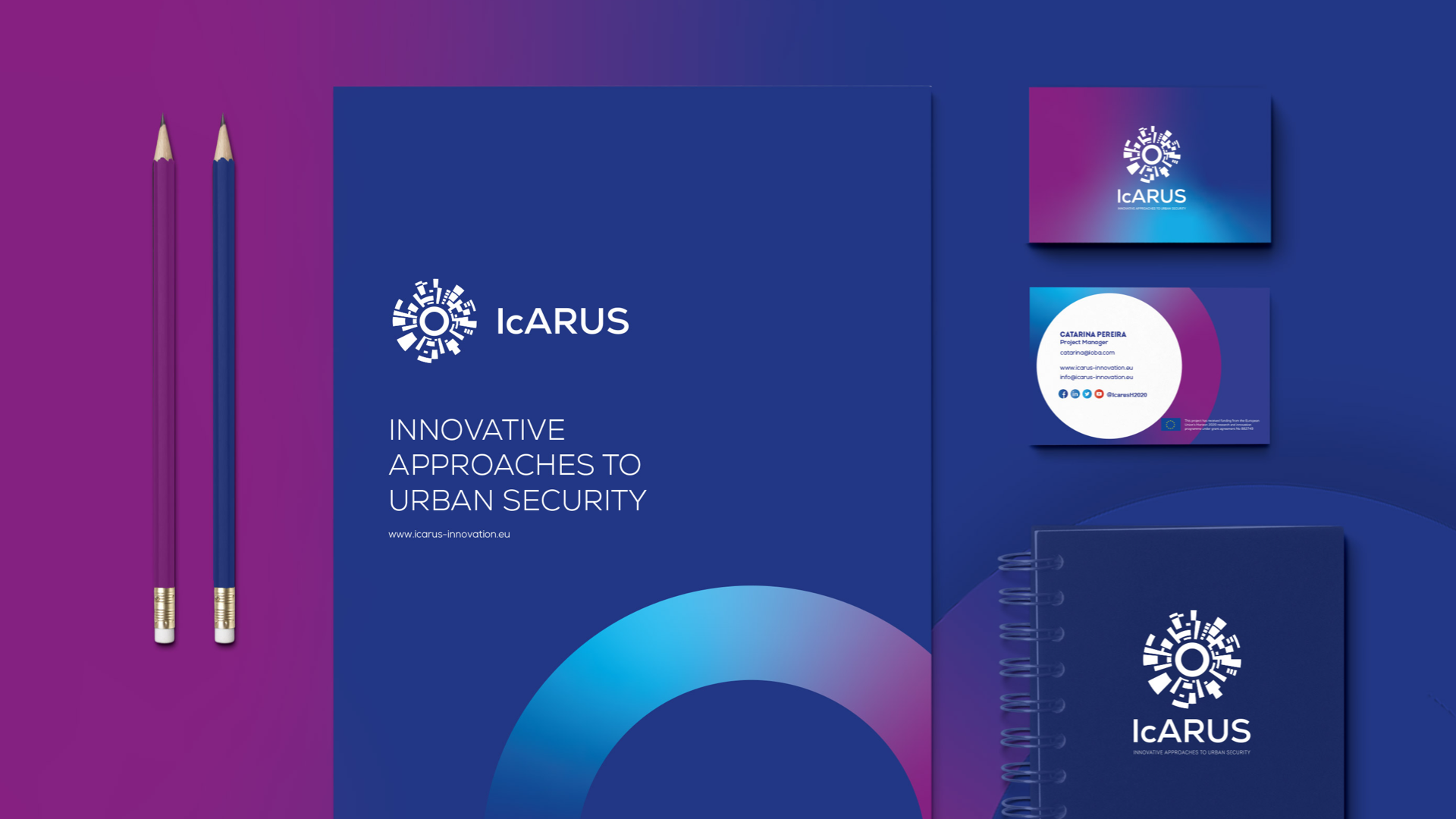
The brand created for IcARUS aimed to provide a cohesive visual identity of the project. The brand was used in the different materials produced under the frame of the project namely templates, brochures, website, posters, roll-up banners and videos, etc.
A brand manual dictating the rules and guidelines on the elements of IcARUS’ identity and how it should be used, has also been developed.